The first thing I noticed when we visited the Bronx Zoo website was the lack of a map. I would be curious to know whether they have ever had a map feature and why they chose not to include one in their most recent site.
As a more visual learner I prefer to explore the exhibits in a way that allows me to walk the park in my mind. The relationship between the exhibits in space is a huge factor in what I would plan on seeing and in what order. But, alas, there was no map to be found (except for the one I found in a google search).
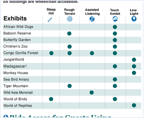
After trying to find anything to give me a sense of the lay of the land there at the zoo, I found this visual that could help me determine whether some attractions would be too far or difficult to access for my pregnant wife:
I am a user trying to get information, as opposed to a designer trying to convey it. I enjoy being in this situation because I get to question the design choices of others within the context of my real-life task – a practice that drives my wife bonkers sometimes.
- There are icons with labels. I enjoy that fact. Icons are their own can make for crappy icons.
- Upon further usage I realized the icons provide little value as they are presented. When I scan across a row for an exhibit I am shown dots within each column. Now that the icons have been set up with nice labels they have been abandoned within the table itself. I found myself having to look up and down to make sense of the dots within each row.
The choice to only use the icons as headers actually added noise to the table.
I would:
- Repeat the icons within the rows instead of introducing the dots. It might clutter up the table, but my gut says that would allow me to focus on each exhibit and understand the various attributes.
- Provide some more context about what the columns actually mean. The phrase “Rough Terrain” confused me a bit. What was rough about it? I am assuming it means it would be tough to push a stroller around?
Screen clipping taken: 5/31/2009, 1:14 PM